User controls allow you to create your own visual controls. A user control is essentially a component with graphical interface that can be placed on forms just like any GUI element. However, note that user controls can have many categories:
The following example introduces a simple user control of the first category, a stand-alone UI Clock control. The project is started by creating a new C# Windows Control Library project:
using System;
using System.Collections;
using System.ComponentModel;
using System.Drawing;
using System.Data;
using System.Windows.Forms;
namespace UserControls
{
[ToolboxBitmap(typeof(Button))]
// Toolbox icon
public class ctlClock: System.Windows.Forms.UserControl
{
private System.Windows.Forms.Label
lblDisplay;
private System.Windows.Forms.Timer
timer1;
private System.ComponentModel.IContainer components;
public ctlClock()
{
// This call is required by the Windows.Forms Form Designer.
InitializeComponent();
}
// Clean up any resources being used.
protected override void Dispose( bool disposing )
{
if( disposing )
{
if( components != null )
components.Dispose();
}
base.Dispose( disposing );
}
#region Component Designer generated code
// Required method for Designer support - do not modify
// the contents of this method with the code editor.
private void InitializeComponent()
{
this.components = new
System.ComponentModel.Container();
this.lblDisplay = new
System.Windows.Forms.Label();
this.timer1 = new
System.Windows.Forms.Timer(this.components);
this.SuspendLayout();
//
// lblDisplay
//
this.lblDisplay.Dock =
System.Windows.Forms.DockStyle.Fill;
this.lblDisplay.Font = new System.Drawing.Font("Microsoft Sans Serif", 24F,
System.Drawing.FontStyle.Regular, System.Drawing.GraphicsUnit.Point, ((System.Byte)(0)));
this.lblDisplay.ForeColor =
System.Drawing.Color.FromArgb(((System.Byte)(0)), ((System.Byte)(192)), ((System.Byte)(0)));
this.lblDisplay.Location = new System.Drawing.Point(0, 0);
this.lblDisplay.Name =
"lblDisplay";
this.lblDisplay.Size = new System.Drawing.Size(160, 56);
this.lblDisplay.TabIndex = 0;
this.lblDisplay.TextAlign =
System.Drawing.ContentAlignment.MiddleCenter;
//
// timer1
//
this.timer1.Enabled = true;
this.timer1.Interval = 1000;
this.timer1.Tick += new System.EventHandler(this.timer1_Tick);
//
// ctlClock
//
this.Controls.Add(this.lblDisplay);
this.Name =
"ctlClock";
this.Size = new System.Drawing.Size(160, 56);
this.ResumeLayout(false);
}
#endregion
#region handlers
//
Handle tick event by displaying current time value. Note use of 'protected
virtual'.
// This allows inheriting classes to
override this handler
protected virtual void timer1_Tick(object sender, System.EventArgs e)
{
this.lblDisplay.Text =
DateTime.Now.ToLongTimeString();
}
#endregion
#region properties
public Color ClockTextColor
{
get { return
lblDisplay.ForeColor; }
set { lblDisplay.ForeColor =
(Color)value; }
}
public Color ClockBackgroundColor
{
get { return
this.BackColor;}
set {this.BackColor =
(Color)value;}
}
#endregion
}
}
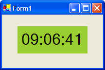
Output from the above code when the control is placed on a Windows Forms is shown below:
The above control can now be used a base control from which other controls can be derived. The following code is for a user control that extends the ctlClock user control by adding alarm capabilities:
public class ctlAlaramClock : UserControls.ctlClock
{
private System.DateTime m_dtAlaram;
private bool bAlaramVisible = false;
private bool bAlaramOn = false;
private System.ComponentModel.Container components = null;
public ctlAlaramClock()
{
// This call is required by the Windows.Forms Form Designer.
InitializeComponent();
// TODO: Add any initialization after the InitializeComponent call
}
#region Properties
public DateTime AlramTime
{
get { return m_dtAlaram; }
set { m_dtAlaram = (DateTime)value; }
}
#endregion
# region overrides
protected override void timer1_Tick(object sender, System.EventArgs e)
{
// Call base class method to
base.timer1_Tick( sender, e );
// Is the current time equal to the alarm time, then display an
alarm
DateTime dtNow = DateTime.Now;
Trace.WriteLine( "Time now: " +
dtNow.ToString() );
Trace.WriteLine( "Alaram time: " +
m_dtAlaram.ToString() );
if (DateTime.Compare( dtNow, m_dtAlaram ) == 0)
bAlaramOn = true;
if (bAlaramOn)
{
if (!bAlaramVisible)
{
bAlaramVisible = true;
lblDisplay.BackColor = Color.Red;
}
else
{
bAlaramVisible = false;
lblDisplay.BackColor = Color.Black;
}
}
}
#endregion
}
Recall that you can create your own users controls or extend others via inheritance, This section highlights differences between various types of controls from which you can inherit and gives considerations regarding the types to choose for your project.
Windows Forms controls refer to the existing controls such as Button, TextBox, Calendar and so on. When you inherit from such a control, you retain all existing functionality while allowing you to extend or limit this inherited functionality. For example, you can inherit from a TextBox and then limit its input only to capital-case. Via inheritance you can then also extend this control by having it verify the entered value via some database table. You may event want to add a custom appearance by overriding the OnPaint() method.
Therefore, inherit from a Windows Forms control if:
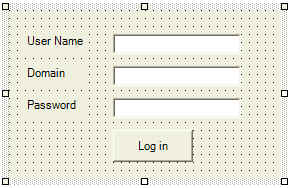
A user control refers to a collection of Windows Forms controls (buttons, treeviews, listboxes, etc) encapsulated into a single container. These controls are referred to as constituent controls. An example of a user control might a control to log users in to a system. In this case, the user control may consist of a few labels, few text boxes, and a button to log on:
In this scenario the container holds all of the inherent functionality associated with each Windows Forms control. Once the above control has been compiled into an assembly, you can then use it in your projects and even inherit from it. Also note that once the user control has been compiled, the constituent controls (labels, buttons, etc) are no longer available to the developer through code. The composite user-control does its own painting and handles all basic functionality associated with controls
Therefore, use a user control if:
The Control class provides all of the basic functionality required by controls (for example, events), but no control-specific functionality or user-interface. Creating a control by inheriting from Control requires a well-thought process as you will have to design the GUI interface including painting and events associated with the new control. The basic functionality provided by Control class:
A typical example of inheriting from the Control class is a GUI clock control that duplicated the look and feel of an analog clock. In this example, the OnPaint method would have to perform custom painting to simulate clock-hand movement.
Therefore, inherit form the Control class if:
A custom control, be it derived from a Windows Forms control, a UserContorl class, or a Control class provides front-end functionality through its graphical interface and back-end functionality through its methods, properties, and events. The following examines issues you should be aware when declaring methods, properties, and events in your contorl.
The constituent controls in a Windows Forms user control must be declared private so that they are not directly accessible by the developer. However, if you need to make the properties of these controls available to developers (users of your custom control), then rather than making the constituent controls public, keep them private and expose their properties via get and set accessors. For example, in the log-in user control shown below, the UserName text box constituent control is made private, and its properties such as Value as accessed from the user control via properties:
public class LogIn : System.Windows.Forms.UserControl
{
// Access the UserName text box
public string UserName
{
get { return tbUserName.Text; }
set { tbUserName.Text = (string)value;
}
}
// Use same approach to access
properties of other constituent controls
...
}
The options you have for control painting depends on the type of the control you are dealing with. If you are authoring a control that derived from the Control class, you have total and full control of how the control should render itself. Of course, you have to provide all of the painting code. If you are authoring a control that derives from one of the Windows Forms controls or that inherits from the UserControl class, you may override the standard graphical representation and provide your own painting code.
Painting of a control is accomplished by overriding the Control.OnPaint method:
protected override voide OnPain( PaintEventArgs pe )
{
// Use pe to access the ClipRectangle
and the Graphics objects
...
}
The ClipRectangle object identifies the rectangle in which the control will be drawn, whereas, the Graphics object encapsulates several graphics-oriented objects and methods necessary to draw your control. Note that if you inheriting from a class that already has graphical representation such as UserControl or Button, and you do not wish to incorporate that representation into your rendering, you should not call the base class's OnPaint method in your OnPaint override.
Recall that the OnPaint will be called when the control is first drawn, and whenever it is resized. However, if a control is resized, ClipRectangle object will only represent the portion that has been resized. To ensure that the control is re-drawn every time it is resized, call the SetStyle function:
SetStyle( ControlStyles.ResizeRedraw, true );
For constituent controls, the story is a bit different since they are a bit inflexible when it comes to custom rendering. All Windows Forms controls handle their rendering via their own OnPaint method. Because this method is protected, it is not accessible to the developer working with the user control (recall that a user control is a collection of constituent controls). This means that OnPaint cannot be prevented from executing when the control is painted. This does not mean that you cannot add code to affect the appearance of constituent controls. Additional rendering can be accomplished by adding an OnPaint event handler. For example, if you wish to add additional rendering beyond what was provided by the Button class, you would add the following code:
MyButton.Paint += new PaintEventHandler( this.MyPaint );
protected void MyPaint( object sender, PaintEventArgs e )
{
// Additional rendering code comes here
}
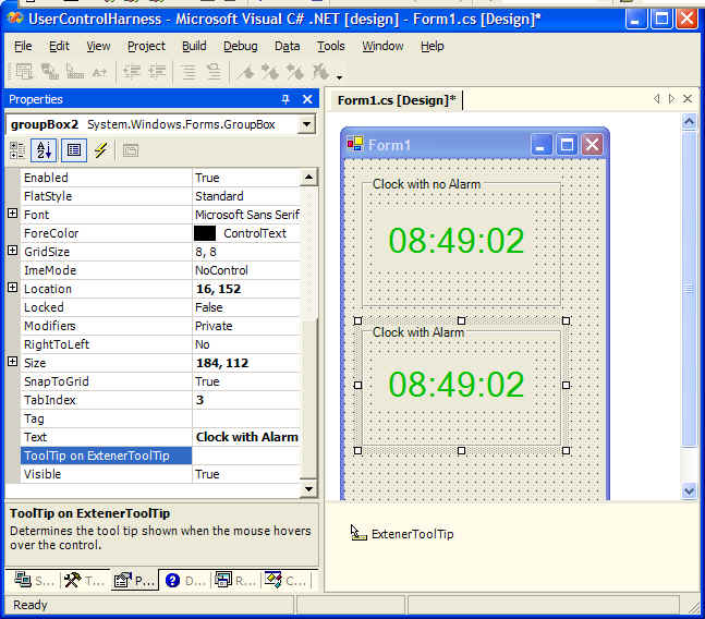
An extender provider, which can also be called property provider, is .... a component that provides properties to other components. For example, when the ToolTip component is added to a form, it provides a property called ToolTip to each control on the form. This ToolTip property will appear in the Properties window of each control. Note that the property provided by the extender provider resides in the property provider itself and is not a true property of the component it modifies. At design-time, the property can be accessed on the modified component through the Properties window. At run-time, however, the property, i.e., ToolTip, cannot be accessed through the modified component.
To use an extender provider like the ToolTip control, just drop the provider (ToolTip). In the screen shot below note how the Properties window for the a GroupBox displays a tooltip property:
Note that an extender provider is a class that implements IExtenderProvider interface, which consists of a single method CanExtend. This function takes an argument called extendee and it is up to CanExtend to examine extendee and determine whether it can have the extra property/properties provided by the extender provider:
// Can
public bool CanExtend( object extendee )
{
// In this implementation, we want the
properties provided by
// this extender provider only be applied to Buttons
if (extendee is Button)
return true;
else
return false
}
For details on how to implement an extender provider, see Windows Forms Extender Provider Sample in MSDN.
How do you know what extender providers are provided by VisualStudio.NET? Looking at IExtenderProvider interface in MSDN, the following classes are extender providers: