The .NET Framework provides a number of namespaces devoted to two-dimensional graphical rendering. In addition to the basic functionality such as Pens, Brushes, Fonts, etc., there are also types that enable geometric transformation, anti-aliasing, and palette blending. Collectively, these namespaces make up GDI+. The following table lists the major namespaces used in GDI+:
| GDI+ Namespace | Meaning |
| System.Drawing | The core GDI+ namespaces which defines numerous types for basic rendering - pens, brushes and the Graphics type |
| System.Drawing.Drawing2D | Types used in more-advanced 2D graphics - gradient brushes, geometric transformations, etc. |
| System.Drawing.Imaging | Types that allow you to manipulate images |
| System.Drawing.Printing | Types that allow you to perform and manage various printing functionalities |
| System.Drawing.Text | Types that allow you to manipulate collections of fonts. |
When you wish to use the GDI+ system you must set a reference to the System.Drawing.dll assembly. Once a reference has been set, use the C# using keyword and you are ready to render.
A vast majority of the types used when programming GDI+ applications are found in the System.Drawing namespace. There are classes that represent bitmaps, pens, brushes, fonts and a number of other related types such Color, Point, Size, and Rectangle, among many others. Many of these types make a substantial use of a number of related enumerations most of which are also defined in the System.Drawing namespace.
The following code examines some of the utility classes such as Point, Size, Rectangle. Note that these types also have a float version where the underlying data is represented as floats:
using System;
using System.Drawing;
using System.Collections;
using System.ComponentModel;
using System.Windows.Forms;
using System.Data;
namespace GDI
{
public class Form1 : System.Windows.Forms.Form
{
...
public Form1()
{
...
TestPoint();
TestRectangle();
TestRegion();
}
// The main entry point for the application.
[STAThread]
static void Main()
{
Application.Run(new Form1());
}
/* this function tests some of the basic features of Point */
private void TestPoint()
{
// Create a new point
Point pt1 = new Point( 10, 10 );
Console.WriteLine( "pt1 is : {0}, {1}", pt1.X, pt1.Y); // 10, 10
// Offset pt1 10 points in the X-direction and -10 points in the Y-direction
pt1.Offset( 10, -10);
Console.WriteLine( "pt1 is : {0}, {1}", pt1.X, pt1.Y); // 20, 0
// Create a _copy_ of pt1
Point pt2 = pt1;
pt2.X = 100;
Console.WriteLine( "pt1 is : {0}, {1}", pt1.X, pt1.Y); // 20, 0
Console.WriteLine( "pt2 is : {0}, {1}", pt2.X, pt2.Y); // 100,0
}
/* this function tests some of the basic features of Rectangle */
private void TestRectangle()
{
// Create a new rectangle
Rectangle rc = new Rectangle( 0, 0, 100, 200); // width is 100, height is 200
// One of the more useful functions of Rectangle is Contains. It allows you
// to determine if the given point or rectangle is within the bounds of
// of the current rectangle
Point p = new Point( 10, 10 );
if (rc.Contains( p ))
Console.WriteLine("Point ({0}, {1}) is within the rectangle");
}
/* this function tests some of the basic features of Region */
private void TestRegion()
{
// The region class represents the interior of a geometric shape. Given the
// last statement, it would make sense for the constructors of Region to
// require an instance of some existing geometric shape. The following code
// gets the interior of a Rectangle and examines various
attributes
Rectangle rc = new Rectangle( 0, 0, 100, 200 );
Region rg = new Region( rc );
}
}
}
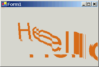
The Control class defines a virtual method called OnPaint(). When a form or any descendant of Control wishes to render graphical information, you must override this method and extract a Graphics object from the incoming PaintEventArgs parameter. Recall that when responding to GUI events, you have two ways at your disposal: either override the appropriate virtual method, or use delegates (preferred).
OnPaint() is called whenever a paint message is places into the application's message queue. This can happen either automatically when the window becomes dirty - resized, covered by another window, or minimized/maximized/restored - or programmatically by inserting a paint message in the application's message queue by calling Invalidate().
Note: to correctly render images when resizing the control, either set the ResizeRedraw style to true, or handle the Resize event by calling Invalidate(). Here is what happens if you don't!
The following code illustrates the above concepts. The code redraw the string "Hello GDI+" in a new location and in a new size every time the window is repainted - by resizing and minimizing/maximizing/restoring:
using System;
using System.Drawing;
using System.Collections;
using System.ComponentModel;
using System.Windows.Forms;
using System.Data;
namespace Paint
{
public class Form1 : System.Windows.Forms.Form
{
// Data members
private Point pt = new Point(0, 0 );
// new location where to draw string
public Form1()
{
// A control must always have ResizeRedraw set to true. As an alternative, handle the
// Resize message and call Invalidate() in the handler
Console.WriteLine( "ResizeRedraw is " + GetStyle( ControlStyles.ResizeRedraw ).ToString());
SetStyle( ControlStyles.ResizeRedraw, true);
// Commenting the above and uncommenting the following will have the same effect
as setting
//
ResizeRedraw to true, as long as the Resize event handler called Invalidate()
//this.Resize += new EventHandler( OnResize );
}
[STAThread]
static void Main()
{
Application.Run(new Form1());
}
// Overriding OnPaint() to handle painting event. Extract the Graphics object
from the
// PaintEventArgs and use it to perfrom reqiured rendering
protected override void OnPaint( PaintEventArgs e )
{
// Update rendering location. Pt.X is also used to set the font size
pt.X = pt.X + 1;
pt.Y = pt.Y + 1;
Console.WriteLine("OnPaint - {0}, {1}", pt.X,
pt.Y);
// Extract the Graphics object
Graphics g = e.Graphics;
// Perform required rendering at a new location and in a new size
g.DrawString( "Hello GDI+", new Font("Arial",pt.X), new SolidBrush( Color.Chocolate),
pt.X, pt.Y);
}
// Uncomment this code as an alternative to setting the ResizeRedraw bit in the
form's style
/*public void OnResize( object sender, EventArgs e)
{
Invalidate();
}*/
}
}
You may need to render graphics outside the scope of a standard paint handler. For example, you wish to draw a small circle at a the position where a mouse was clicked. The first step is to obtain a Graphics object using Graphics.FromHwnd() and then do the drawing in the Click handler:
private void Form1_Click( Object sender, MouseEventArgs e)
{
// Get a graphics object
Graphics g = Graphics.FromHwnd( this.Handle );
// Draw the circle
g.DrawEllipse( new Pen(Color.Green), e.X, e,Y, 10,
10);
}
Unfortunately, this will not work because if a form is invalidated and hence redrawn, all the drawn circle will be erased. That's what Invalidate() does. It just erases the form (with the background brush, but more on that later). The general approach is as follows: OnPaint() should always handle painting. In this scenario, when a mouse is clicked, add a new point to an internal collection and call Invalidate(). This will erase the background of the control and call OnPaint(). OnPaint() can then iterate through each point in the collection and draw the circle in the location indicated by the current point.
Now that you know how to obtain a Graphics object - either within OnPaint() or outside the paint handler, you need to understand how to manipulate it. The System.Graphics class is the key to rendering GDI+ rendering functionality. This object represents a valid device context (i.e., DC in Win32) coupled with many methods that allow you to render text, images, as well as many numerous geometric patterns.
Some of the rendering methods include but are not limited to DrawArc(), DrawBeziers(), DrawEllipse(), FillPolygon(), MeasureString(), and many many others.
The Graphics class also defines a number of methods that encapsulate how the current rendering operation will look and feel. For example, InterpolationMode specifies how data is interpolated between endpoints using a related enumeration. CompositingMode property determines whether drawing overwrites the background or is blended with the background. Look up these and many more in MSDN for more details.
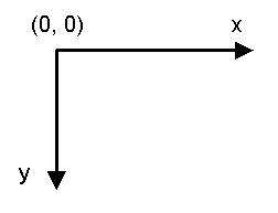
The default unit of measurement is pixel-based and places the origin in the upper-left corner as illustrated below:
The default graphics unit is the pixel. This can be changed setting the PageUnit property of the Graphics class object to any value of the GraphicsUnit enumeration:
g.PageUnit = GraphicsUnit.Millimeter;
g.DrawEllipse( new Pen(Color.Green), 10, 10 , 100,
100); // x and y locations are 10 and 10
millimeters, respectively
What if you want to alter the location where rendering begins, i.e., you want to offset the point of origin. You can adjust the point of origin by calling Graphics.TranslateTransform(nNewXOrigin, nNewYOrigin) method.
The Color structure represents an Alpha-Red-Green-Blue color constant. Most of the functionality of the Color type comes by way of a number of static properties, which return a configured color:
// Get a Color object
Color c = Color.PaleVioletRed;
// Various properties and functions
float fBrightness = c.GetBrightness();
byte bAlpha = c.A;
int nARGBValue = c.ToArgb();
The System.Drawing.Font type represents a font installed on the user's machine. The Font class has a number of overloaded constructors. Here are some of the more common ones:
// font name is Arial and size is 12
points
Font f1 = new Font("Arial", 12);
// font name is Courier New and size is 12 points, and it
bold and underlines
Font f2 = new Font("Courier New", 10, FontStyle.Bold |
FontStyle.Underline );
Once you have created and configured your font, the next usual task is to pass it to Graphics.DrawString()method. Even though DrawString has been overloaded a few times, the basic required information is the same - string to draw, a font, a brush for rendering, and a location to draw the string.
You can programmatically discover what fonts are installed on a user's machine. Doing so, gives the chance to explore another namespace, System.Drawing.Text:
// The following code lists the
installed fonts
using System.Drawing.Text;
string strFonts = "";
InstalledFontCollection fonts = new InstalledFontCollection();
for (int i = 0; i < fonts.Families.Length; i++)
{
strFonts += fonts.Families[i].Name + " ";
}
Console.WriteLine( "Installed fonts are: {0}", strFonts);
The following examines how to manipulate pens and brushes to render geometric patterns. You could do so using nothing more than the basic types defined in System.Drawing. However, many of the sexy pen and brush configurations - gradient brushes, etc. - require types defined within the System.Drawing.Drawing2D namespace.
This additional namespace provides a number of classes that allow you to modify the line cap - triangle, diamond, etc. - used for a given pen, build textured brushes, as well as work with vector graphics manipulations. Here are some of the core types to be aware of:
| System.Drawing.Drawing32 Namespace | Meaning |
| AdjustableArrowCap CustomLineCap |
Pen caps are used to paint the beginning and end points of a given line. These types represent an adjustable arrow-shaped and a user defined cap. |
| Blend ColorBlend |
Used to define a blend pattern used in conjunction with a LinearGradientBrush. |
| GraphicsPath GraphicsPathIterator PathData |
A GraphicsPath object represents a series of connected lines and curves. This class allows you to insert just any type of geometrical pattern into the path |
| HatchBrush LinearGradienBrush PathGradientBrush |
Exotic brush types |
Notice that some of the enumerations in System.Drawing.Drawing2D namespace - such as QualityMode and SmoothingMode - allow you to define the quality of the current rendering operation. When you obtain a Graphics object, it has a default rendering quality which somewhere in between with respect to speed and quality. When you wish to override the current rendering quality for a Graphics object, make use of the SmoothingMode property:
private void OnPaintHandler(Object sender, PaintEventArgs e)
{
// Obtain the graphics object
Graphics g = e.Graphics;
// Do some rendering
g.SmoothingMode = SmoothingMode.AntiAlias;
g.DrawString( "Drawing2D", new Font("Arial", 20), new SolidBrush( Color.Tomato), 10,10);
}
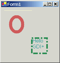
GDI+ Pen objects are used to draw lines. Typically, when you want to render certain graphical objects, you pass an instance of a pen. The Pen class defines a small number of constructors that allow you to determine the initial color of the pen, and the width of the pen nib. Some constructors of the Pen class allow you even to specify a brush (more on that later).
Remember that in addition to the Pen type, GDI+ also provides a Pens collection which allows you to retrieve standard pen on the fly without having to create one by hand. Be aware that the pens returned will always have a width of 1. If you require a more exotic pen, you will need to create one by hand.
private void OnPaintHandler(Object sender, PaintEventArgs e)
{
// Obtain the graphics object
Graphics g = e.Graphics;
// Make a big pen by hand, and get
another from the stock collection
Pen p1 = new Pen( Color.IndianRed, 10);
Pen p2 = Pens.LemonChiffon;
// Render some shapes with the pens
g.DrawLine( p2, new Point(10,10), new Point(100,10));
g.DrawEllipse( p1, 30,30, 40,50);
// Draw text inside a dashed rectangle
Pen p3 = new Pen(Color.SeaGreen, 5 );
p3.DashStyle = DashStyle.DashDot;
Rectangle r = new Rectangle( 100,100, 50,50 );
g.DrawRectangle( p3, r);
g.DrawString( "Hello GDI+", new Font("Arial", 10), new SolidBrush( Color.DarkCyan ), r);
}
The result:
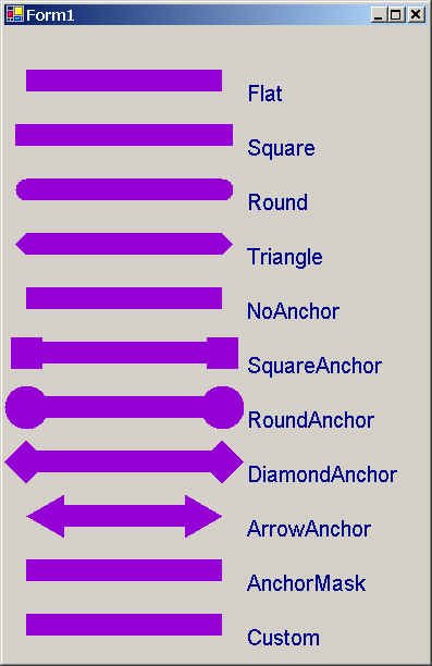
Using the LineCap enumeration you able to build pens where you specify how the end and beginning of the line will look like. The following code draws a series of lines using each of the available LineCap styles.
protected override void OnPaint(PaintEventArgs e)
{
// Obtain the graphics object
Graphics g = e.Graphics;
// Create a pen
Pen p = new Pen( Color.DarkViolet, 20);
// Get all members of the LineCap enum. Note how this is done
Array ar = Enum.GetValues( typeof( LineCap) );
// Loop through the array of LineCap values and draw each line cap
for (int i = 0; i < ar.Length; i++)
{
// Set the start and end cap
LineCap lc = (LineCap)ar.GetValue(i);
p.StartCap = lc;
p.EndCap = lc;
// Now draw a line with the selected caps
g.DrawLine( p, new Point(20, (i+1)*50), new Point(200, (i+1)*50));
g.DrawString( lc.ToString(), new Font("Arial", 12), new SolidBrush( Color.DarkBlue), 220, (i+1)*50);
}
The output looks like the following:
GDI+ Brush-derived types are used to fill the space between lines with a given color, pattern, or image. Recall that the Brush type is an abstract type that cannot be instantiated directly. Rather, this class serves as a base class for other related brush types such as SolidBrush, HatchBrush, and LinearGradientBrush. System.Drawing also defines two types that return stock or standard brushes - Brushes and SystemBrushes. Using a properly configured brush you are able to call any number of methods such as DrawString() and FillXXX() functions. Recall that you can also create a pen by making use of a brush which allows you to render geometric patterns as you draw lines.
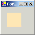
private void TestBrushes( PaintEventArgs e )
{
Graphics g = e.Graphics;
SolidBrush br1 = (SolidBrush)Brushes.Moccasin;
g.FillRectangle( br1, 50, 20, 200, 200);
}
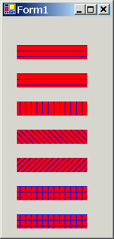
HatchBrush allows you to fill a region using a very large number of predefined patterns, represented by the HatchStyle enumeration. When you create a hatch brush you need to specify foreground and background colors:
private void DrawHatchBrushes( PaintEventArgs e )
{
Graphics g = e.Graphics;
// Get all members of the HatchStyle
enum. Note how this is done
Array ar = Enum.GetValues( typeof( HatchStyle ) );
// Loop through the array of HatchStyle
values and draw each hatch brush
for (int i = 0; i < ar.Length; i++)
{
// Create brush based on the curent hatch style
HatchStyle CurrentHS = (HatchStyle)ar.GetValue(i);
HatchBrush hbr = new HatchBrush( CurrentHS, Color.Blue, Color.Red);
g.FillRectangle( hbr, 20, (i+1)*40, 100, 20);
}
}
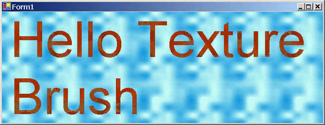
A TextureBrush allows you to attach a bitmap image to a brush, and is typically used in conjunction with a fill operation. A TextureBrush is assigned an Image reference for use during its lifetime. The image is usually either a separate file (.gif, .bmp, .jpg, etc.) or is embedded into a .NET assembly.
private void DrawTextureBrush( PaintEventArgs e )
{
Graphics g = e.Graphics;
// Load images
Image imgBackgroundBrush = new Bitmap( "Water.bmp");
Image imgString = new Bitmap("Zapotec.bmp");
// Create texture brushes based on the images
TextureBrush tbr1 = new TextureBrush( imgBackgroundBrush );
TextureBrush tbr2 = new TextureBrush( imgString );
// Draw using the textured brushes
Rectangle r = this.ClientRectangle;
g.FillRectangle( tbr1, r );
g.DrawString( "Hello Texture Brush", new Font("Arial", 60), tbr2, r);
}
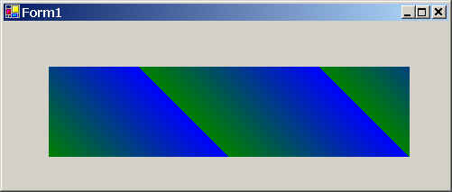
The LinearGradientBrush is used whenever you want to blend two colors together in a gradient pattern. The only point of interest is that you need to specify the direction of the blend, using a value from the LinearGradientMode enumeration.
private void DrawLinearGradientBrush(PaintEventArgs e)
{
Graphics g = e.Graphics;
// Create a linear gradient brush
LinearGradientBrush lgb1 = new LinearGradientBrush( new Rectangle( 0,0, 100,100),
Color.Blue, Color.Green,
LinearGradientMode.BackwardDiagonal );
// Draw a rectangle with the gradient brush
g.FillRectangle( lgb1, 50, 50, 400, 100);
}
System.Drawing.Image class defines a number of methods and properties that hold information regarding the underlying pixel set it represents. In addition, a number of types in System.Drawing.Imaging namespace can be used to facilitate advanced image transformations. In fact, a whole book can be written on the topic of image transformation in GDI+.
Given that the abstract Image class cannot be instantiated, you typically assign objects of type Image to a new instance of the Bitmap class, or simply make a direct instance of the Bitmap type:
Image img1 = new Bitmap( "Image1.bmp" );
Bitmap img2 = new Bitmap( "Image2.bmp" );
g.DrawImage( img1, 10, 10, 200, 200 );
While you are free to render bitmap images directly into a Control-derived type, you will gain far greater control and functionality if the bitmap image is rendered in a PictureBox. Because the PictureBox control derives from Control, you inherit lots of functionality such as the ability to capture events for a particular image, assign a tooltip or a context menu, and so forth.
Recall that an assembly is a collection of types and optional resources. Bundling external resources into an assembly involves the following steps:
As you might expect, all these steps are done automatically when using Visual Studio.NET IDE.
The key to understanding the .NET resource format is to know the types defined within System.Resource namespace. This set of types provides the programmatic means to manipulate both .resx and .resource files. The following are the core types in System.Resource namespace:
| system.Resource type | Meaning |
| IResourceReader IResourceWriter |
These interfaces are implemented by types that know how to read and write .NET resources. You do not need to implement these interfaces unless you want to write your own custom resource reader/writer. |
| ResourceReader ResourceWriter |
These classes provide an implementation of IResourceReader and IResourceWriter interfaces. Using these classes you are able to read from and write to binary .resource files. |
| ResXResourceReader ResXResourceWriter |
These classes provide an implementation of IResourceReader and IResourceWriter interfaces. Using these classes you are able to read from and write to the XML-based .resx files. |
| ResourceManager | Provides easy access to culture-specific resources (BLOBS and strings) at runtime. |
Similar to Visual Studio 6, resources such as strings, icons, bitmaps, dialogs, etc. are added to .resx file. To gain access to those resources programmatically use ResourceManager class:
public void foo()
{
// Open the resource file
ResourceManager rm = new ResourceManger(
typeof(MainForm) );
// Load string resource
string strWelcome = rm.GetString("WelcomeString");
// Load image resource
Bitmap bmp = rm.GetObject("BackgroundImage");
...
}
The ErrorProvider type is used as part of validating user input and is mainly used to provide a visual cue of user input error. To support the ErrorProvider type, you need to understand the following properties of the Control class:
| Control Property | Meaning |
| CausesValidation | Gets/Sets a value indicating whether entering the control causes validation for all controls that require validation. |
| Validated | Occurs when the control finished performing its validation logic |
| Validating | Occurs when the control is validating user input (i.e., when the Control loses focus) |
Focus events occur in the following order:
If CausesValidation property for a control is set to false, the Validating and Validated event will be suppressed. To validate user input, provide set the CausesValidation property for the control to true and provide handlers for both Validating and Validated events. In the Validating event, check user input and if incorrect, set the Cancel property of the CancelEventArgs to true and set the ErrorProvider object as required. This would cancel all the events that would normally occur after the Validating event. If not error occurs, just return. Validated event will then be called. In there, reset the ErrorProvider error. In the following, assume we have a simple form that has a TextBox called txtName and we wish to validate its value:
private void InitializeComponent()
{
...
txtName.Validating += new
System.ComponentModel.CancelEventHandler(this.txtName_Validating);
txtName.Validated += new System.EventHandler(this.txtName_Validated);
...
}
...
protected void txtName_Validating(object sender, System.ComponentModel.CancelEventArgs e)
{
Console.WriteLine("txtName_Validating");
// Validate user input. Must enter 3
letters or more.
if (txtName.Text.Length < 3)
{
errorProvider1.SetError( txtName, "Cannot be less than 3 characters");
e.Cancel = true; // Validated
event will not be fired
}
}
protected void txtName_Validated(object sender, System.EventArgs e)
{
Console.WriteLine("txtName_Validated");
// All conditions have been met. Reset the error provider.
errorProvider1.SetError( txtName, "");
}
A dialog box is nothing more that a stylized Form. In general, all dialog boxes should have set the following properties as follows:
To configure how dialog box buttons should respond with respect to dialog box processing, you need to set the DialogResult property. When a dialog button has been assigend DialogResult.OK or DialogResult.Cancel, the dialog box will automatically close. Also you can query this property back in the code that launched the dialog box to see which button was clicked.
Assume the main form has a Button control called button1 - when clicked, it displays a dialog box of type Form2:
// Main Form
private void button1_Click(object sender, System.EventArgs e)
{
Form2 frm2 = new Form2();
// Show modal dialog box (use frm2.Show() to display a modless dialog box)
frm2.ShowDialog( this );
// Get result of user input - OK or
Cancel?
if (frm2.DialogResult == DialogResult.OK)
MessageBox.Show("You clicke OK");
else
MessageBox.Show("You clicke Cancel");
}
// Dialog box form - Form2
public Form2()
{
...
// Center the dialog box with respect to its parent
StartPosition = FormStartPosition.CenterParent;
// Configure dialog buttons
btnClose.DialogResult = DialogResult.OK;
btnCancel.DialogResult = DialogResult.Cancel;
}
...