The Geometry class and its derived classes such as EllipseGeometry, PathGeometry, and CombinedGeometry, enable you to describe the geometry of a 2-D shape. These geometric descriptions have many uses, such defining a shape to paint to the screen or defining hit-test and clip regions. You can even use a geometry to define an animation path. Geometry objects can be simple, such as rectangles and circles, or composite, i.e., created from two or more geometry objects. More complex geometries can be created by using the PathGeometry and StreamGeometry classes, which enable you to describe arcs and curves.
The Geometry and Shape classes seem similar in that they both describe 2-D shapes (i.e., EllipseGeometry vs Ellipse, RectangleGeometry vs. Rectangle, LineGeometry vs. Line). However, there are important differences:
| Category/Class | Geometry | Shape |
| Inheritance |
Inherits from the Freezable. Geometry objects cannot render themselves or participate in the layout system. |
Inherits from FrameworkElement. Because they are elements, Shape objects can render themselves and participate in the layout system. |
| Usability |
Geometry objects are more versatile. |
Shape objects such as Rectangle and Line are more readily usable. |
| Rendering |
Geometry objects can be used to
define the geometric region for 2-D graphics, define a region for
clipping, or define a region for hit testing. |
Shape objects are used to render 2-D graphics, but cannot define clipping or hit-testing regions. |
The base class for all geometries is the abstract class Geometry. The classes which derive from the Geometry class can be roughly grouped into three categories: simple geometries, path geometries, and composite geometries, as shown in the inheritance hierarchy for Geometry:
System.Windows.Media.Geometry
System.Windows.Media.EllipseGeometry
System.Windows.Media.LineGeometry
System.Windows.Media.RectangleGeometry
System.Windows.Media.PathGeometry
System.Windows.Media.StreamGeometry
System.Windows.Media.CombinedGeometry
System.Windows.Media.GeometryGroup
For completeness, inheritance hierarchy for Shape is also shown below:
System.Windows.Shapes.Shape
System.Windows.Shapes.Ellipse
System.Windows.Shapes.Line
System.Windows.Shapes.Path
System.Windows.Shapes.Polygon
System.Windows.Shapes.Polyline
System.Windows.Shapes.Rectangle
The following sections describe these classes in more detail.
Simple geometry classes include LineGeometry, RectangleGeometry, and EllipseGeometry and are used to create basic geometric shapes, such as lines, rectangles, and circles.
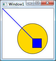
As noted previously, a Geometry object is unable to draw itself, while a Shape-derived object such as Path is able to draw itself. Therefore, the example uses a Path shape to render a few simple geometries:
<Window x:Class="Geometry.SimpleGeometry"
xmlns="http://schemas.microsoft.com/winfx/2006/xaml/presentation"
xmlns:x="http://schemas.microsoft.com/winfx/2006/xaml"
Title="Window1" Height="300" Width="300">
<Grid>
<!-- Ellipse:
The position of the ellipse is defined by a Center structure
and X and Y radii -->
<Path Stroke="Black"
StrokeThickness="1" Fill="Gold">
<Path.Data>
<EllipseGeometry Center="100,100" RadiusX="50" RadiusY="50" />
</Path.Data>
</Path>
<!-- Rectangle:
The position and the dimensions of the rectangle are defined by a Rect
structure. The position is top,left
at 100,100 and the height and width are both 30,
which creates a square-->
<Path Stroke="Black"
StrokeThickness="1" Fill="Blue">
<Path.Data>
<RectangleGeometry Rect="100,100, 30,30" />
</Path.Data>
</Path>
<!-- Line: Just
define starting (x1,y1) and ending points (x2, y2) -->
<Path Stroke="Blue"
StrokeThickness="2">
<Path.Data>
<LineGeometry StartPoint="0,0" EndPoint="100,100"/>
</Path.Data>
</Path>
</Grid>
</Window>
The output of the code above is shown below:
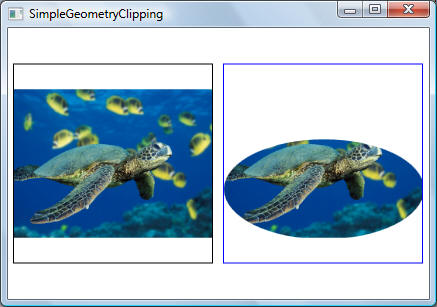
The following example shows how to use an EllipseGeometry as the clip region for an image. Only the part of the image that is within the area of the ellipse will be displayed.
<Window x:Class="Geometry.SimpleGeometryClipping"
xmlns="http://schemas.microsoft.com/winfx/2006/xaml/presentation"
xmlns:x="http://schemas.microsoft.com/winfx/2006/xaml"
Title="SimpleGeometryClipping" Height="300" Width="500">
<StackPanel Orientation="Horizontal">
<Border BorderBrush="Black"
BorderThickness="1" Width="200" Height="200" Margin="5">
<Image
Source="D:\Projects\NET_WPF\Figures\Green Sea Turtle.jpg" />
</Border>
<Border BorderBrush="Blue"
BorderThickness="1" Width="200" Height="200" Margin="5">
<Image
Source="D:\Projects\NET_WPF\Figures\Green Sea Turtle.jpg">
<Image.Clip>
<EllipseGeometry Center="100,100" RadiusX="100" RadiusY="50"/>
</Image.Clip>
</Image>
</Border>
</StackPanel>
</Window>
Output is shown below
The PathGeometry class and its light-weight equivalent, the StreamGeometry class, provide the means to describe multiple complex figures composed of arcs, curves, and lines. At the heart of a PathGeometry is a collection of PathFigure objects with each PathFigure object describing a discrete shape. Each PathFigure is itself comprised of one or more PathSegment objects, each of which describes a segment of the figure. There are many types of segments such as ArcSegment, LineSegment, BezierSegment, and many more.
Like the PathGeometry class, a StreamGeometry defines a complex geometric shape that may contain curves, arcs, and lines. Unlike a PathGeometry, the contents of a StreamGeometry do not support data binding, animation, or modification. Use a StreamGeometry when you need to describe a complex geometry but do not want the overhead of supporting data binding, animation, or modification. Because of its efficiency, the StreamGeometry class is a good choice for describing adorners
The segments within a PathFigure are combined into a single geometric shape with the end point of each segment being the start point of the next segment. The StartPoint property of a PathFigure specifies the point from which the first segment is drawn. Each subsequent segment starts at the end point of the previous segment. The following is a very basic example illustrating the use of a single PathFigure with a single LineSegment:
Output is shown below:
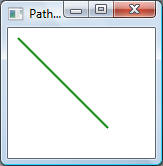
The syntax used for a PathGeometry is much more verbose than that used for a simple LineGeometry, and it may make more sense to use the LineGeometry class in this case, but the verbose syntax of the PathGeometry allows for extremely intricate and complex geometric regions.
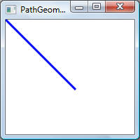
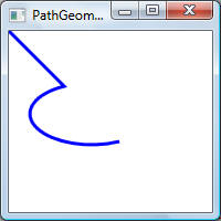
The following example shows how to use ArcSegment segment:
<!--
A line starts at (0,0) and ends at (50,50). For the arc, default radius is 0, hence ArcSegment
appears as a line starting at (50,50) and ending at (100,100) -->
<LineSegment Point="50,50"/>
<ArcSegment Point="100,100" />
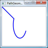
<!-- Same as
above but given arc has x and y radii of (25,25)
Note: The figure below will apply to Size values from (25,25) to (1,1) -->
<LineSegment Point="50,50"/>
<ArcSegment Point="100,100" Size="25,25" />

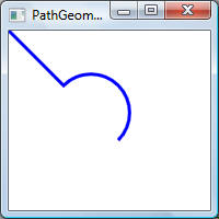
<!-- Left figure:
Shows effect of increasing x radius to 50 -->
<LineSegment Point="50,50"/>
<ArcSegment Point="100,100" Size="50,25" />
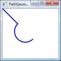
<!-- Right
figure: Shows effect of increasing y radius to 50 -->
<LineSegment Point="50,50"/>
<ArcSegment Point="100,100" Size="25,50" />
<!-- Left figure: arc is
drawn clockwise -->
<LineSegment Point="50,50"/>
<ArcSegment Point="100,100" Size="25,25" SweepDirection="Clockwise" />
<!-- Right figure: arc is
drawn counter clockwise -->
<LineSegment Point="50,50"/>
<ArcSegment Point="100,100" Size="25,25" SweepDirection="Counterclockwise" />
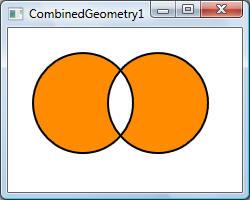
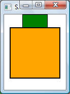
Composite geometry objects can be created using a CombinedGeometry element or by calling the static Geometry.Combine method. The CombinedGeometry object and the Combine method performs a Boolean operation to combine the area defined by two geometries. Geometry objects that have no area are discarded. Only two Geometry objects can be combined (although these two geometries may also be composite geometries).
The following example illustrates how to use a CombinedGeometry element. Note the use of GeometryCombineMode to set the combine mode to Xor.
<Window x:Class="Geometry.CombinedGeometry1"
xmlns="http://schemas.microsoft.com/winfx/2006/xaml/presentation"
xmlns:x="http://schemas.microsoft.com/winfx/2006/xaml"
Title="CombinedGeometry1" Height="200" Width="250">
<Grid>
<Path Stroke="Black" StrokeThickness="2"
Fill="DarkOrange">
<Path.Data>
<CombinedGeometry GeometryCombineMode="Xor">
<CombinedGeometry.Geometry1>
<EllipseGeometry Center="75,75" RadiusX="50" RadiusY="50" />
</CombinedGeometry.Geometry1>
<CombinedGeometry.Geometry2>
<EllipseGeometry Center="150,75" RadiusX="50" RadiusY="50" />
</CombinedGeometry.Geometry2>
</CombinedGeometry>
</Path.Data>
</Path>
</Grid>
</Window>
Transforms are used to rotate, scale, skew, or translate FrameworkElement objects. Specifically, a Transform defines how to map, or transform, points from one coordinate space to another coordinate space. This mapping is described by a transformation Matrix, which is a collection of three rows with three columns of Double values.
Matrix structure encapsulates a 3x3 affine matrix used for transformations in 2D space. Affine transformation matrices can be multiplied to form any number of linear transformations, such as rotation and skew (shear), followed by translation. An affine transformation matrix has its final column equal to (0, 0, 1), so only the members in the first two columns need to be specified. However, WPF also provides a set of classes that enable you to transform objects without working directly with matrices: RotateTransform, ScaleTransform, SkewTransform, and TranslateTransform. The following shows the structure of a WPF matrix:
| M11 | M12 | 0.0 |
| M21 | M22 | 0.0 |
| OffsetX | OffsetY | 1.0 |
Where M11, M12, M21, M22, OffsetX, and OffsetY are members of System.Windows.Media.Matrix structure.
By manipulating matrix values, you can rotate, scale, skew, and move (translate) an object. For example, if you change the value of OffsetX to 100, you can use it to move an object 100 units along the x-axis. If you change the value of M22 to 3, you can use it to stretch an object to three times its current height. If you change both values, you move the object 100 units along the x-axis and stretch its height by a factor of 3.
Typically you apply a transformation by using one of the transform classes (RotateTransform, ScaleTransform, SkewTransform, TranslateTransform) and apply it to the transformation property of the object. The following is a few WPF types and their corresponding transformation properties:
| Type | Transformation Property |
| FrameworkElement |
RenderTransform, LayoutTransform |
| UIElement | RenderTransform |
| Geormetry | Transform |
| Brush | Transform, RelativeTransfrom |
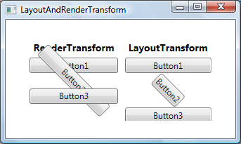
With respect to RenderTransform and LayoutTransform usage, use the RenderTransform property whenever possible, especially when you use animated Transform objects. Use the LayoutTransform property when scaling, rotating, or skewing and you need the parent of the element to adjust to the transformed size of the element. Note that, when they are used with the LayoutTransform property, TranslateTransform objects appear to have no effect on elements. That is because the layout system returns the translated element to its original position as part of its processing.
The following examples illustrate the main transformation classes and their typical usage:
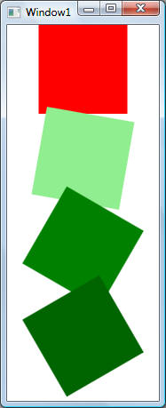
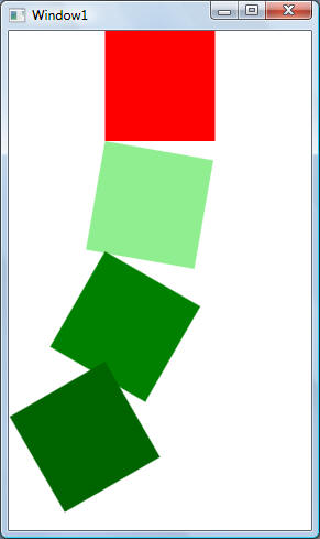
This example shows how to rotate an object. In the code below CenterX and CenterY properties of the RotateTransform specify the point about which the object is rotated. This center point is expressed in the coordinate space of the element that is transformed. By default, the rotation is applied to (0,0), which is the upper-left corner of the object to transform:
<Window x:Class="Transforms.Rotate"
xmlns="http://schemas.microsoft.com/winfx/2006/xaml/presentation"
xmlns:x="http://schemas.microsoft.com/winfx/2006/xaml"
Title="Window1" Height="300" Width="300">
<StackPanel Orientation="Vertical">
<Rectangle Width="100" Height="100"
Fill="Red"/>
<Rectangle Width="100" Height="100"
Fill="LightGreen">
!-- The following is the pattern to use to specify
transforms.
RenderTransform is the transformation property -->
<Rectangle.RenderTransform>
<!-- Rotate a rectangle 10 degrees about its center
(50,50). Note that by default,
a transform is centered at the origin of the target object's coordinate system,
i.e.,
at (0,0). -->
<RotateTransform CenterX="50" CenterY="50" Angle="10" />
</Rectangle.RenderTransform>
</Rectangle>
<Rectangle Width="100" Height="100"
Fill="Green">
<Rectangle.RenderTransform>
<RotateTransform CenterX="50" CenterY="50" Angle="30" />
</Rectangle.RenderTransform>
</Rectangle>
<Rectangle Width="100" Height="100"
Fill="DarkGreen">
<Rectangle.RenderTransform>
<RotateTransform CenterX="50" CenterY="50" Angle="60" />
</Rectangle.RenderTransform>
</Rectangle>
</StackPanel>
</Window>
The following picture shows the effect of rotating each rectangle about its default origin, (0,0):
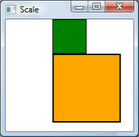
This example shows how to use ScaleTransform to scale an element to different sizes. Use the ScaleX and ScaleY properties to resize the element by the factor you specify. Use the CenterX and CenterY properties to specify the point that is the center of the scale operation. By default, a ScaleTransform is centered at the point (0,0), which corresponds to the upper-left corner of the rectangle. This has the effect of moving the element and also of making it appear larger, because when you apply a Transform, you change the coordinate space in which the object resides:
<Window x:Class="Transforms.Scale"
xmlns="http://schemas.microsoft.com/winfx/2006/xaml/presentation"
xmlns:x="http://schemas.microsoft.com/winfx/2006/xaml"
Title="Scale">
<StackPanel Orientation="Vertical">
<Rectangle Height="50" Width="50"
Fill="Green" Stroke="Black" StrokeThickness="1"/>
<Rectangle Height="50" Width="50"
Fill="Orange" Stroke="Black" StrokeThickness="1">
<Rectangle.RenderTransform>
<ScaleTransform CenterX="0" CenterY="0" ScaleX="2" ScaleY="2" />
</Rectangle.RenderTransform>
</Rectangle>
</StackPanel>
</Window>
Outputs are shown below:
Typically, you set CenterX and CenterY to the center of the object that is scaled: (Width/2, Height/2).
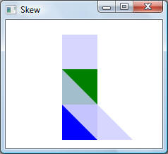
A skew, which is also known as a shear, is a transformation that stretches the coordinate space in a non-uniform manner. One typical use of a SkewTransform is for simulating 3-D depth in 2-D objects. Use the CenterX and CenterY properties to specify the center point of the SkewTransform. Use the AngleX and AngleY properties to specify the skew angle of the x-axis and y-axis, and to skew the current coordinate system along these axes:
<Window x:Class="Transforms.Skew"
xmlns="http://schemas.microsoft.com/winfx/2006/xaml/presentation"
xmlns:x="http://schemas.microsoft.com/winfx/2006/xaml"
Title="Skew" Height="300" Width="300">
<Canvas>
<Rectangle Height="50" Width="50"
Fill="#CCCCCCFF" Canvas.Left="80" Canvas.Top="21" />
<Rectangle Height="50" Width="50"
Fill="Blue" Canvas.Left="80" Canvas.Top="120"/>
<Rectangle Height="50" Width="50"
Fill="#CCCCCCFF" Canvas.Left="80" Canvas.Top="120">
<Rectangle.RenderTransform>
<SkewTransform CenterX="0" CenterY="0" AngleX="45" AngleY="0" />
</Rectangle.RenderTransform>
</Rectangle>
<Rectangle Height="50" Width="50"
Fill="Green" Canvas.Left="80" Canvas.Top="70"/>
<Rectangle Height="50" Width="50"
Fill="#CCCCCCFF" Canvas.Left="80" Canvas.Top="70">
<Rectangle.RenderTransform>
<SkewTransform CenterX="0" CenterY="0" AngleX="0" AngleY="45" />
</Rectangle.RenderTransform>
</Rectangle>
</Canvas>
</Window>
Output is shown below (compare overlapped squared with each other):
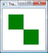
<Window x:Class="Transforms.Translate"
xmlns="http://schemas.microsoft.com/winfx/2006/xaml/presentation"
xmlns:x="http://schemas.microsoft.com/winfx/2006/xaml"
Title="Translate" Height="300" Width="300">
<Canvas>
<Rectangle Height="50" Width="50"
Fill="Green" Canvas.Left="20" Canvas.Top="20"/>
<Rectangle Height="50" Width="50"
Fill="Green" Canvas.Left="20" Canvas.Top="20">
<Rectangle.RenderTransform>
<TranslateTransform X="50" Y="50" />
</Rectangle.RenderTransform>
</Rectangle>
</Canvas>
</Window>
In the figure shown below, both squared are located at the same coordinates, however the second square is translated by 50 pixels along X- and Y-axis:
The following example shows the effect of using RenderTransform and LayoutTransform transformation properties:
<Window x:Class="Transforms.LayoutAndRenderTransform"
xmlns="http://schemas.microsoft.com/winfx/2006/xaml/presentation"
xmlns:x="http://schemas.microsoft.com/winfx/2006/xaml"
Title="LayoutAndRenderTransform" Height="300" Width="300">
<StackPanel Orientation="Horizontal" HorizontalAlignment="Center"
Margin="20">
<StackPanel Orientation="Vertical"
Margin="5">
<Label
Content="RenderTransform" FontWeight="Bold" FontSize="14"/>
<Button
Content="Button1" />
<Button
Content="Button2" RenderTransformOrigin="0.5, 0.5">
<Button.RenderTransform>
<RotateTransform Angle="45"/>
</Button.RenderTransform>
</Button>
<Button
Content="Button3" />
</StackPanel>
<StackPanel Orientation="Vertical"
Margin="5">
<Label
Content="LayoutTransform" FontWeight="Bold" FontSize="14"/>
<Button
Content="Button1" />
<Button
Content="Button2" RenderTransformOrigin="0.5, 0.5">
<Button.LayoutTransform>
<RotateTransform Angle="45"/>
</Button.LayoutTransform>
</Button>
<Button
Content="Button3" />
</StackPanel>
</StackPanel>
</Window>
The output is shown below:
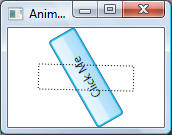
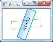
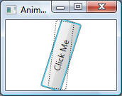
Because they inherit from the Animatable class, the Transform classes can be animated. The following example shows how to animate the rotation of a button:
<Window x:Class="Transforms.AnimateTransform1"
xmlns="http://schemas.microsoft.com/winfx/2006/xaml/presentation"
xmlns:x="http://schemas.microsoft.com/winfx/2006/xaml"
Title="AnimateTransform1" Height="300" Width="300">
<Grid>
<Button Width="100" Height="30"
Content="Click Me" RenderTransformOrigin="0.5,0.5">
<!-- Transformation -->
<Button.RenderTransform>
<RotateTransform Angle="0" x:Name="AnimatedRotateTransform" />
</Button.RenderTransform>
<!-- Animation -->
<Button.Triggers>
<EventTrigger RoutedEvent="Button.Click">
<BeginStoryboard>
<Storyboard>
<DoubleAnimation Storyboard.TargetName="AnimatedRotateTransform"
Storyboard.TargetProperty="Angle"
To="320" AutoReverse="True" RepeatBehavior="2x"/>
</Storyboard>
</BeginStoryboard>
</EventTrigger>
</Button.Triggers>
</Button>
</Grid>
</Window>
The following shows a few screen shots while the animation was running:
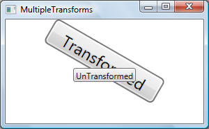
For creating more complex transformations, WPF provides TransformGroup and MatrixTransform classes. This example shows how to use a TransformGroup to group two or more Transform objects into a single composite Transform:
<Window x:Class="Transforms.MultipleTransforms"
xmlns="http://schemas.microsoft.com/winfx/2006/xaml/presentation"
xmlns:x="http://schemas.microsoft.com/winfx/2006/xaml"
Title="MultipleTransforms" Height="300" Width="300">
<StackPanel Margin="50">
<Button Width="90" Height="20"
RenderTransformOrigin="0.5,0.5" HorizontalAlignment="Center"
Content="Transformed">
<Button.RenderTransform>
<!-- TransformGroup enables you to apply multiple transforms. In this example,
the button is scaled and rotated. -->
<TransformGroup>
<!-- Triple the size (scale) of the button in the Y
direction. -->
<ScaleTransform ScaleY="2" ScaleX="2"/>
<!-- Rotate the button by 30 degrees. -->
<RotateTransform Angle="30" />
</TransformGroup>
</Button.RenderTransform>
</Button>
<!-- Another
button used for comparison against the transformed button -->
<Button Width="90" Height="20"
HorizontalAlignment="Center" Content="UnTransformed" />
</StackPanel>
</Window>
The output is shown below:
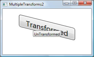
This example shows how to use
<Window x:Class="Transforms.MultipleTransforms2"
xmlns="http://schemas.microsoft.com/winfx/2006/xaml/presentation"
xmlns:x="http://schemas.microsoft.com/winfx/2006/xaml"
Title="MultipleTransforms2" Height="300" Width="300">
<StackPanel Margin="50">
<Button
Width="90" Height="20" RenderTransformOrigin="0.5,0.5" HorizontalAlignment="Center"
Content="Transformed">
<Button.RenderTransform>
<MatrixTransform>
<MatrixTransform.Matrix>
<Matrix M11="2" M22="2" M12="0.5"></Matrix>
</MatrixTransform.Matrix>
</MatrixTransform>
</Button.RenderTransform>
</Button>
<Button
Width="90" Height="20" HorizontalAlignment="Center" Content="UnTransformed" />
</StackPanel>
</Window>
Output is shown below: